source("scripts/R/cdi-plot-theme.R")

library(ggplot2)
library(dplyr)

counts_df <- read.csv("data/demo-counts.csv", check.names = FALSE)
rownames(counts_df) <- counts_df[, 1]
counts_df <- counts_df[, -1, drop = FALSE]
counts <- as.matrix(counts_df)
storage.mode(counts) <- "numeric"

metadata <- read.csv("data/demo-metadata.csv", stringsAsFactors = FALSE)

library_size <- colSums(counts)
norm_counts <- sweep(counts, 2, library_size, "/") * 10000
log_counts <- log1p(norm_counts)

gene_vars <- apply(log_counts, 1, var)
var_order <- order(gene_vars, decreasing = TRUE)
variable_genes <- rownames(log_counts)[var_order[1:200]]Dimensionality Reduction and Clustering
Why This Lesson Matters
In Lesson 3, we learned:
- PCA amplifies variance.
- Feature selection determines which variance is amplified.
- Highly variable genes shape downstream embeddings.
Now we allow that selected variance to define structure.
Dimensionality reduction does not create biology.
It compresses variance into interpretable axes.
Load Data and Recompute Variable Genes
Principal Component Analysis
pca_input <- t(log_counts[variable_genes, ])

pca_res <- prcomp(pca_input, center = TRUE, scale. = FALSE)

pca_df <- data.frame(
  PC1 = pca_res$x[, 1],
  PC2 = pca_res$x[, 2],
  percent_mt = metadata$percent_mt,
  batch = metadata$batch
)

summary(pca_res)$importance[2, 1:5]
PC1 PC2 PC3 PC4 PC5
0.10858 0.10163 0.01318 0.01274 0.01270 PCA Colored by Mitochondrial Percentage
ggplot(pca_df, aes(x = PC1, y = PC2, color = percent_mt)) +
  geom_point(size = 2.2, alpha = 0.85) +
  scale_color_viridis_c(option = "viridis") +
  labs(
    title = "PCA colored by mitochondrial percentage",
    subtitle = "Technical structure may align with selected variance",
    x = "PC1",
    y = "PC2",
    color = "percent_mt"
  ) +
  cdi_theme()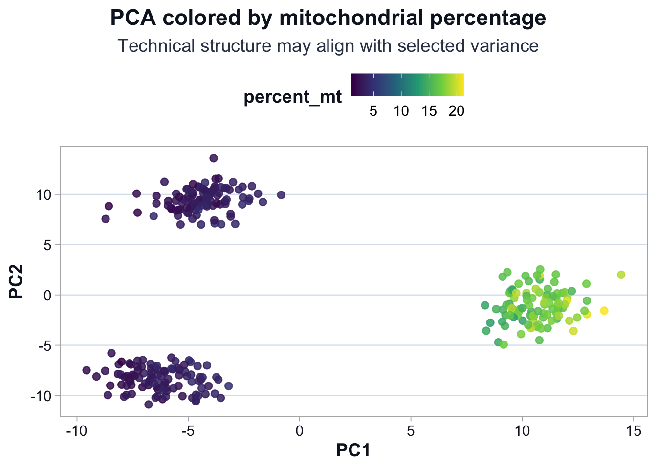
Interpretation
If percent_mt aligns with PC1 or PC2:
- Mitochondrial-associated genes influenced the selected variance.
- Technical variation contributes to visible structure.
Structure is diagnostic, not automatically biological.
PCA Colored by Batch
ggplot(pca_df, aes(x = PC1, y = PC2, color = batch)) +
  geom_point(size = 2.2, alpha = 0.85) +
  labs(
    title = "PCA colored by batch",
    subtitle = "Batch-driven separation reflects structured variance",
    x = "PC1",
    y = "PC2",
    color = "Batch"
  ) +
  cdi_theme()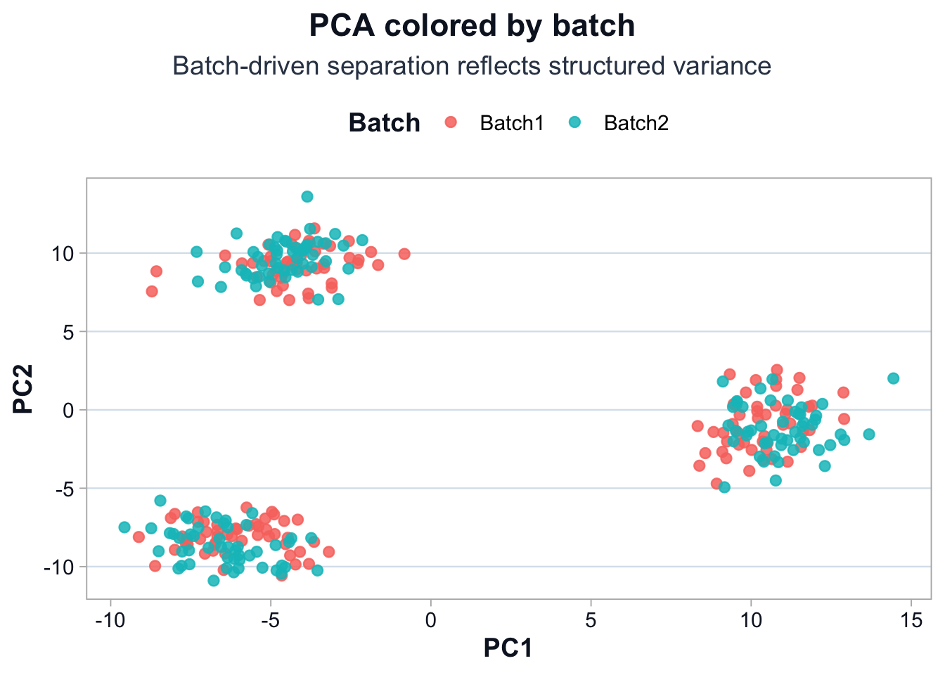
Interpretation
If batch drives separation:
- Batch influences variable genes, or
- True biology differs between batches.
Structure alone cannot resolve this.
Clustering in Reduced Space
set.seed(123)
clusters <- kmeans(pca_res$x[, 1:2], centers = 3)$cluster
pca_df$cluster <- factor(clusters)
PCA with Cluster Assignments
ggplot(pca_df, aes(x = PC1, y = PC2, color = cluster)) +
  geom_point(size = 2.2, alpha = 0.9) +
  labs(
    title = "PCA with cluster assignments",
    subtitle = "Clusters reflect structure in selected variance space",
    x = "PC1",
    y = "PC2",
    color = "Cluster"
  ) +
  cdi_theme()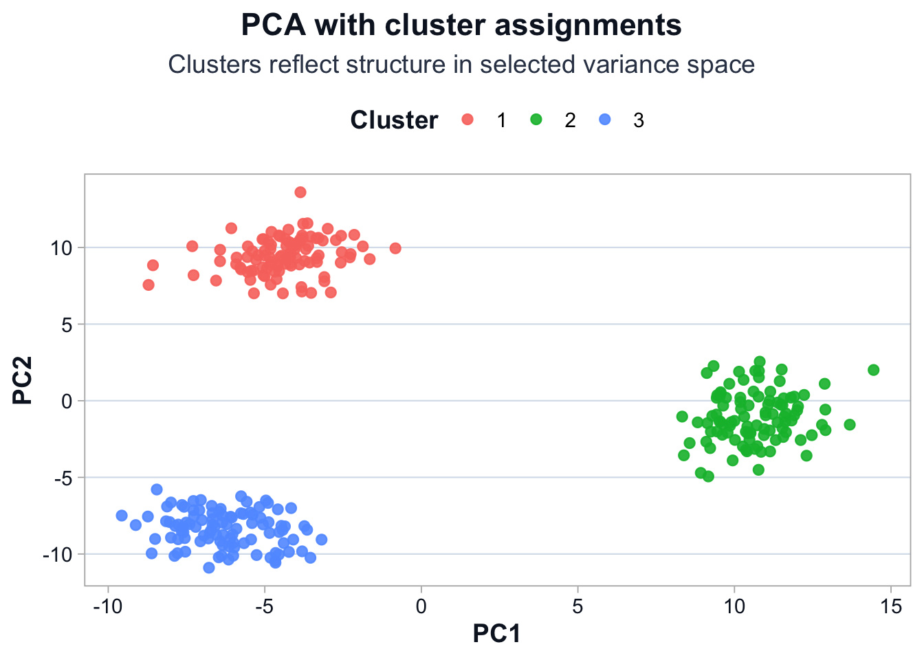
What Clusters Represent
Clusters represent cells similar in selected variance space.
They are the compression of selected variance, not biological labels.
Mitochondrial Percentage by Cluster
ggplot(pca_df, aes(x = cluster, y = percent_mt, fill = cluster)) +
  geom_boxplot(alpha = 0.8) +
  labs(
    title = "Mitochondrial percentage by cluster",
    subtitle = "Cluster-level QC alignment must be evaluated",
    x = "Cluster",
    y = "percent_mt"
  ) +
  cdi_theme()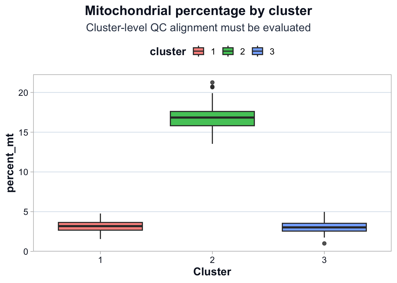
Interpretation
If one cluster has elevated mitochondrial percentage:
- Structure is partially technical.
- Marker interpretation must be calibrated.
- Biological claims must be constrained.
Structure is variance geometry.
Meaning requires calibration.
What This Lesson Established
You now understand:
- PCA amplifies selected variance.
- Technical metrics can align with structure.
- Clusters reflect compressed variance space.
- QC must be evaluated at cluster level.
Next lesson: from clusters to marker genes.