- ID: SC-L03
- Type: Data Transformation
- Audience: Public
- Theme: How normalization and variance structure determine downstream embeddings
Why This Lesson Matters
Raw single-cell counts are not directly comparable across cells.
Cells differ in:
- Sequencing depth
- Capture efficiency
- Library size
If we reduce dimensions without normalization, PCA may primarily capture total counts rather than biology.
Normalization determines what structure is allowed to emerge.
Feature selection determines which genes are allowed to shape that structure.
Load Data
source("scripts/R/cdi-plot-theme.R")

library(ggplot2)
library(dplyr)

counts_df <- read.csv("data/demo-counts.csv", check.names = FALSE)
rownames(counts_df) <- counts_df[, 1]
counts_df <- counts_df[, -1, drop = FALSE]

counts <- as.matrix(counts_df)
storage.mode(counts) <- "numeric"

metadata <- read.csv("data/demo-metadata.csv", stringsAsFactors = FALSE)

dim(counts)
Step 1: Library Size Normalization
We normalize counts per 10,000 reads per cell.
normalized count = raw_count / total_counts * 10,000
library_size <- colSums(counts)

norm_counts <- sweep(counts, 2, library_size, "/") * 10000

summary(library_size)
   Min. 1st Qu.  Median    Mean 3rd Qu.    Max.
  565.0   619.0   646.0   654.4   693.0   772.0
Interpretation
- Cells are now comparable in total scale.
- Depth differences are reduced.
- Expression distributions remain skewed.
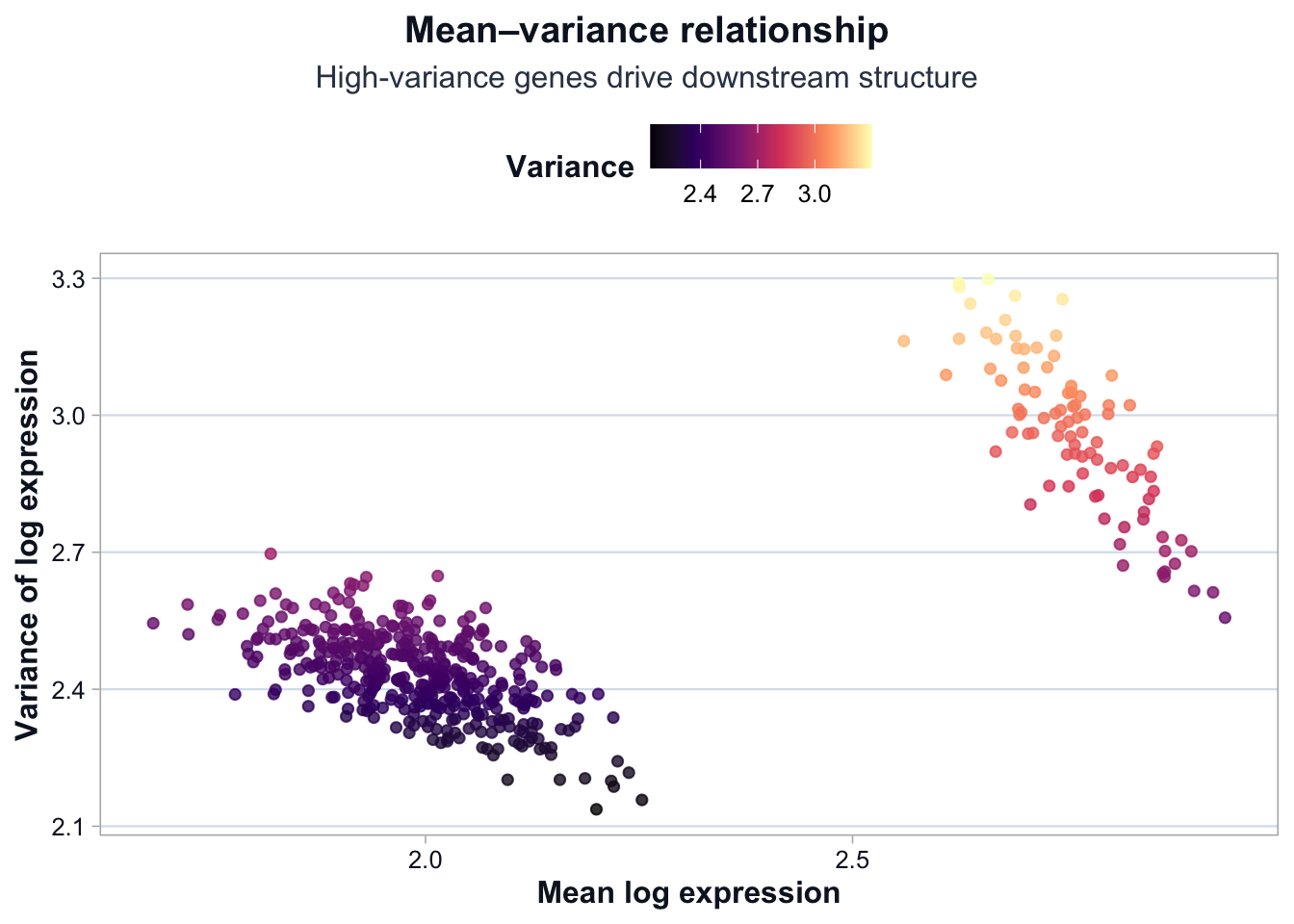
Step 3: Mean–Variance Structure
Highly variable genes tend to drive structure in reduced space.
gene_means <- rowMeans(log_counts)
gene_vars  <- apply(log_counts, 1, var)

mv_df <- data.frame(
  gene = rownames(log_counts),
  mean = gene_means,
  variance = gene_vars
)
Mean–Variance Relationship
ggplot(mv_df, aes(x = mean, y = variance, color = variance)) +
  ggplot2::geom_point(alpha = 0.8, size = 1.6) +
  ggplot2::scale_color_viridis_c(option = "magma") +
  ggplot2::labs(
    title = "Mean–variance relationship",
    subtitle = "High-variance genes drive downstream structure",
    x = "Mean log expression",
    y = "Variance of log expression",
    color = "Variance"
  ) +
  cdi_theme()
Interpretation
Two key patterns emerge:
- Variance increases with mean expression.
- A subset of genes exhibits substantially higher variance.
These high-variance genes are most likely to drive:
- Principal component separation
- Cluster formation
- Marker gene detection
Low-variance genes contribute relatively little to structure.
PCA does not discover structure — it amplifies variance.
Feature selection determines which variance is amplified.
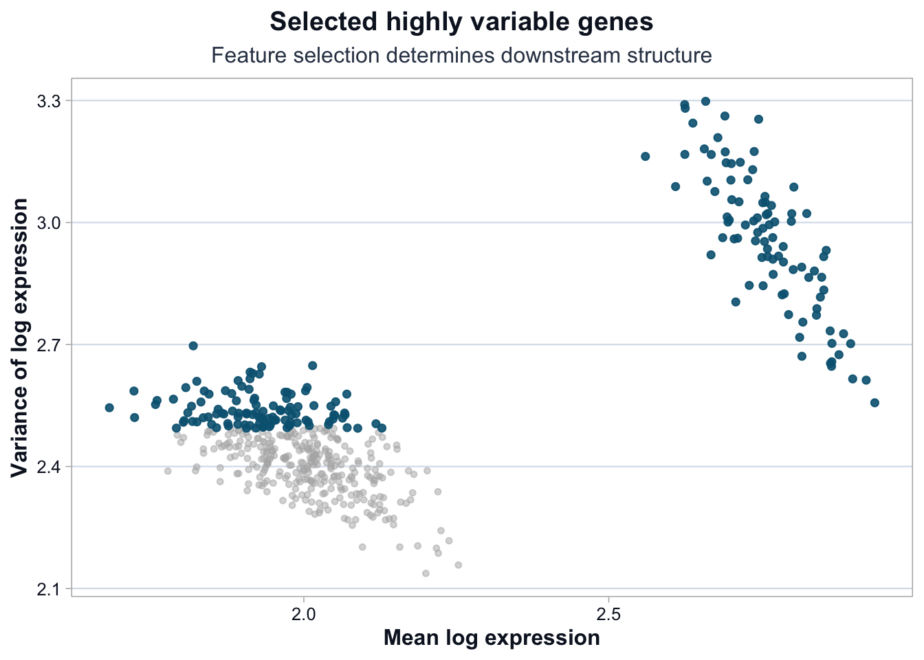
Step 4: Selecting Highly Variable Genes
n_variable <- 200

var_order <- order(gene_vars, decreasing = TRUE)
variable_genes <- rownames(log_counts)[var_order[1:n_variable]]

length(variable_genes)
[1] "Gene89" "MT-Gene18" "Gene29" "Gene71" "Gene41" "MT-Gene10"
Highlight Selected Genes
mv_df$selected <- ifelse(mv_df$gene %in% variable_genes, "Selected", "Other")

ggplot(mv_df, aes(x = mean, y = variance)) +
  ggplot2::geom_point(
    data = subset(mv_df, selected == "Other"),
    color = "grey70",
    alpha = 0.5,
    size = 1.2
  ) +
  ggplot2::geom_point(
    data = subset(mv_df, selected == "Selected"),
    color = "#036281",
    alpha = 0.9,
    size = 1.6
  ) +
  ggplot2::labs(
    title = "Selected highly variable genes",
    subtitle = "Feature selection determines downstream structure",
    x = "Mean log expression",
    y = "Variance of log expression"
  ) +
  cdi_theme()
What This Lesson Established
You now understand:
- Why raw counts must be normalized.
- Why log transformation stabilizes variance.
- How mean–variance structure reveals informative genes.
- Why highly variable genes shape embeddings.
- That dimensionality reduction amplifies selected variance.
Next: Dimensionality Reduction and Clustering.